Best Paint Colors for Retail Stores That Boost Sales
Color isn’t just decoration, it’s psychology in action. The hues on your walls can influence how long customers stay, what they buy, and how they feel while shopping. That’s why smart retailers turn to professionals like a Gresham OR commercial painting contractor to help create the right atmosphere from the ground up. Choosing the right shades isn’t about guesswork, it’s about strategy, and that’s exactly where a trusted local painter, shines.
In this post, you’ll learn how paint color impacts customer behavior, which shades fit specific store types, and how to design a palette that drives more sales.
This matters just as much in a growing commercial market like Tigard, where new retail spaces and storefronts are opening as the community continues to expand. Store owners here are learning that the right commercial painting contractor can be the difference between a space that blends in and one that pulls people through the door.
The Psychology Behind Color Choices
Every color evokes emotion. Retailers who understand this can subtly guide customers’ decisions through their environment.
Red grabs attention and creates urgency, perfect for clearance sections or impulse-buy displays.
Blue inspires trust and calmness, making it ideal for tech, healthcare, or wellness stores.
Yellow stimulates optimism and energy, often used in children’s or casual apparel shops.
Green symbolizes balance and freshness, great for organic, eco-friendly, or natural product retailers.
Black and gray give off sophistication and luxury, commonly used in high-end boutiques or electronics stores.
Color decisions should always align with brand identity. For example, a skincare store painted in deep red might send the wrong message, too aggressive for a space meant to relax and reassure.
Matching Color to Your Store Type
The best retail environments are immersive. They use color to support their products and customer journey.
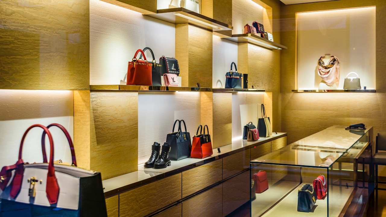
Fashion and apparel stores: Warm neutrals paired with soft accent colors create a comfortable, elegant feel. Beige walls with muted pinks or blues can make clothing stand out instead of competing for attention.
Grocery or organic stores: Use natural greens and earthy tones to reinforce health and sustainability. Customers subconsciously associate these colors with freshness and quality.
Electronics or tech shops: Cool blues, silvers, and whites give a modern, trustworthy vibe. Lighting and glossy finishes can enhance the futuristic appeal.
Children’s stores: Bright, cheerful palettes; yellows, aquas, and light greens, energize the space and encourage playfulness.
Even subtle differences can shift customer behavior. A deep, saturated tone might make a store feel smaller and more exclusive, while lighter tones make it airy and approachable.
Creating a Color Strategy That Converts
A professional color consultation can take the guesswork out of choosing paint. Experts analyze foot traffic, lighting, and customer demographics before recommending a scheme that fits both function and style.
Here’s a simple approach to start planning your palette:
Define your brand personality – Are you bold and energetic or calm and refined?
Consider lighting – Natural light softens warm hues, while artificial light enhances cooler tones.
Zone your space – Use accent colors to highlight promotions, dressing rooms, or checkout areas.
Test before committing – Paint small swatches and view them at different times of day.
The right colors won’t just make your space look good, they’ll enhance comfort, trust, and buying intent.
Case Study: How a Paint Refresh Boosted Boutique Sales
We saw this firsthand with a boutique in downtown Tigard. After repainting the sales floor in sage green with soft ivory trim, the owner told us foot traffic and time-in-store both picked up within the first month.
Why Professional Help Pays Off
DIY painting can cut costs short term, but commercial projects require precision, planning, and materials that withstand heavy foot traffic. A seasoned contractor knows how to pair colors that fit your lighting, layout, and brand vision, ensuring your space works as hard as your sales team does.
The right paint color can mean the difference between a store that’s forgettable and one that converts passersby into loyal customers.
Ready to give your Tigard storefront a color plan that works as hard as you do? Contact us, and let's map out a palette built to bring customers in.